The story behind Brooklyn Heritage Script

Many years ago, while visiting the Guggenheim Museum in New York, I stumbled upon the Verlag typeface initially designed for the museum by Hoefler & Co. I started looking into the history of the typeface and learned that Verlag, in turn, was inspired by Frank Lloyd Wright’s iconic Art Deco lettering that appears on the side of the museum.
A few years later, the impression that Verlag had left in my mind started turning into a new grotesque font family that many of you now know as Brooklyn Heritage. At that point, the start of BH wasn’t very successful simply because it turned out to be rather similar to a few other typefaces and, in my opinion, didn’t stand out well enough. So, it went offline, and then I spent a few years thinking and sketching while trying to develop a new idea.

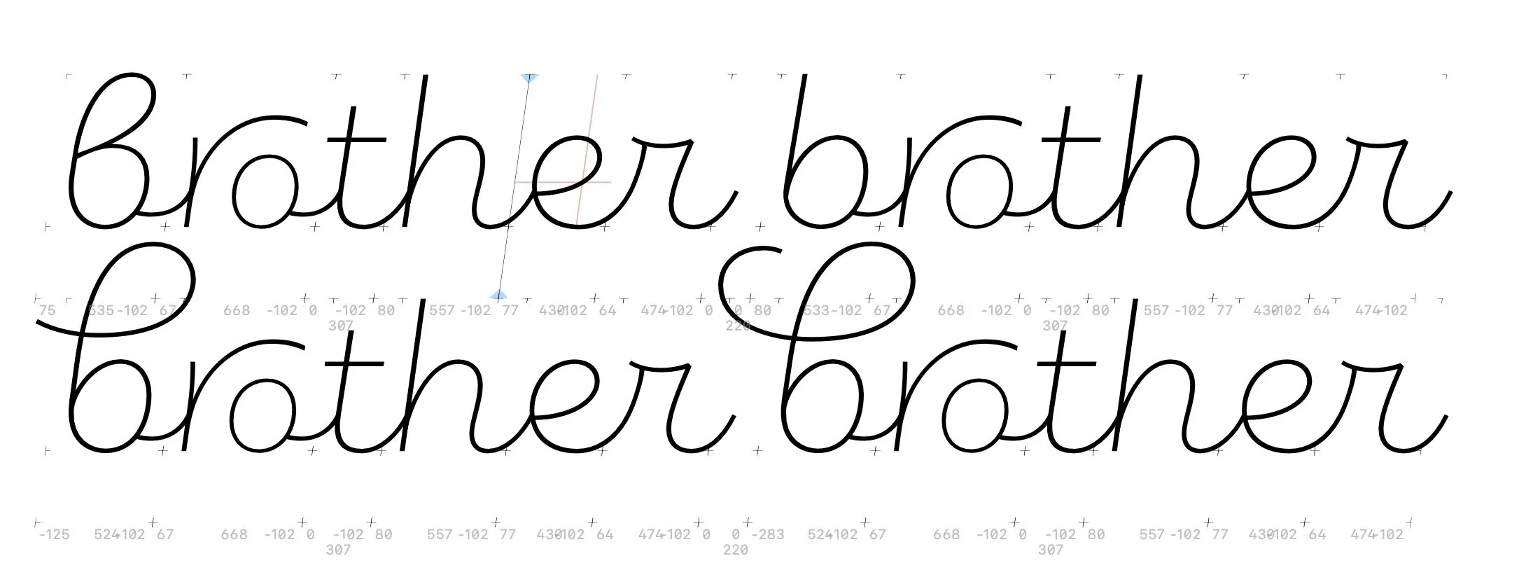
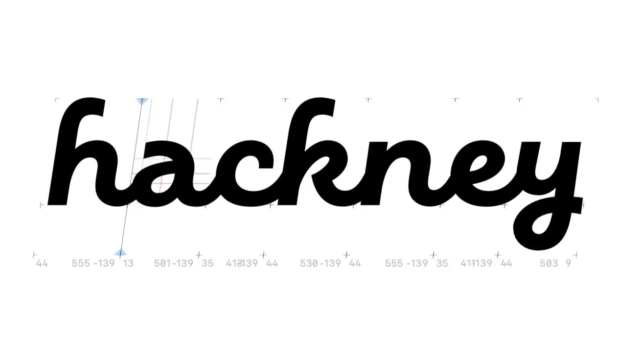
Well, one morning, I woke up and thought, why don’t I turn this grotesque into a monolinear-connected script that would pair well with Verlag or any other similar grotesque typefaces. And that was the beginning of the current version of the Brooklyn Heritage Script family.
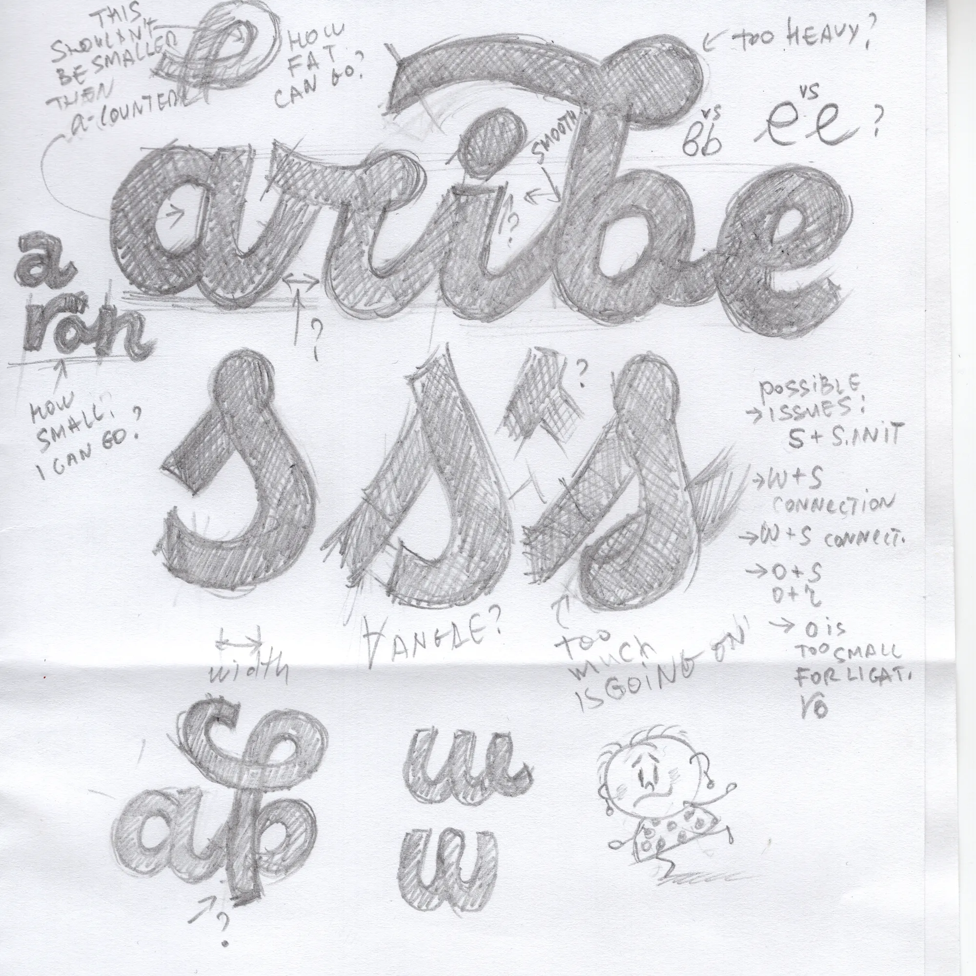
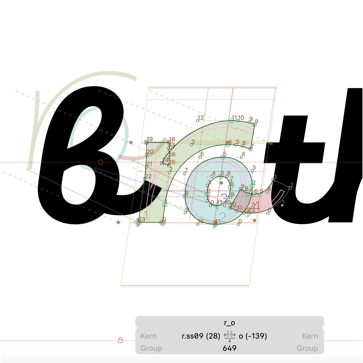
Here is a sketch that I made on an Edinburgh-London train a few years ago and a few new try-ons of alternates and ligatures that are yet to be included (or not!) into the glyphs set.

