The Seasons: Story behind

How The Seasons started….
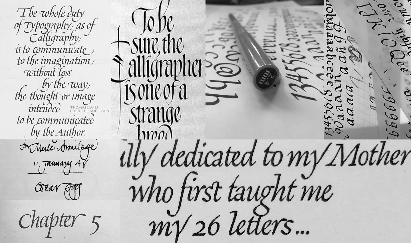
At some point last year, somewhere between designing other typefaces and stressing out about lockdown, I’ve started exploring a new to me area of typography - humanistic cursive fonts. Starting from The 26 letters book (by Oscar Ogg) that, knowing my obsession with typography and handlettering, a friend of mine gave me for my birthday a year before (with the author autograph and a message, not to me of course, but still nice touch!), I moved to exploring all sorts of humanistic cursive fonts, handlettering examples (have you seen Charles Pearce or Hermann Zapf original lettering pieces?) trying to develop a unique feel, not setting boundaries for angles, contrast, axes and terminals.
The idea was to create a classic yet friendly typeface, a font family, to give it a little bit of “freedom” and a touch of modern feel.
To emphasize on the “classic and slightly vintage feeling”, all upright style O’s (and corresponding letters such as C, D, G, Q and the lowercase a, b , c, d, e, f, g etc) were given the strong angle diagonal axis. To make it more modern - high contrast between thin and thick strokes. To merry the uprights with italics - soft sheared terminals with a sharp cut. To make it more fun - uppercase ligatures and swashes.
Unfortunately (or fortunately) at the time when I started working on The Seasons, I hadn’t worked with Pilot parallel pen much. Basically, I knew what it is and a little of “how to” and that was it. So the whole thing started with exploration of the pen’s possibilities, angles, shapes etc. To be honest, even after hours and hours spent creating the font family, I still don’t have enough experience in working with parallel pen to call myself even a beginner. :)
 Some handlettering stuff…
The italics came to me first. The upright fonts were to follow. Lots of paper, lots of soap to clean my hands afterwards, lots of frustration. But I am more or less happy with the result. I’m sure that after a few months I will want to improve the whole thing.
It was my second attempt on true or calligraphic italics. The first one was based on the classic Garamond - see Above the Beyond font family.
Paper used: Conqueror premium office paper, calligraphy pads, glossy paper (much easier to right on but impossible to achieve high contrast)
Pen: Pilot parallel pen, mostly 2.4 mm size.
Ink: Pilot cartridges for parallel pens - nothing fancy.